Wendingen – Dudok’s Townhall design and executed works
1924
sold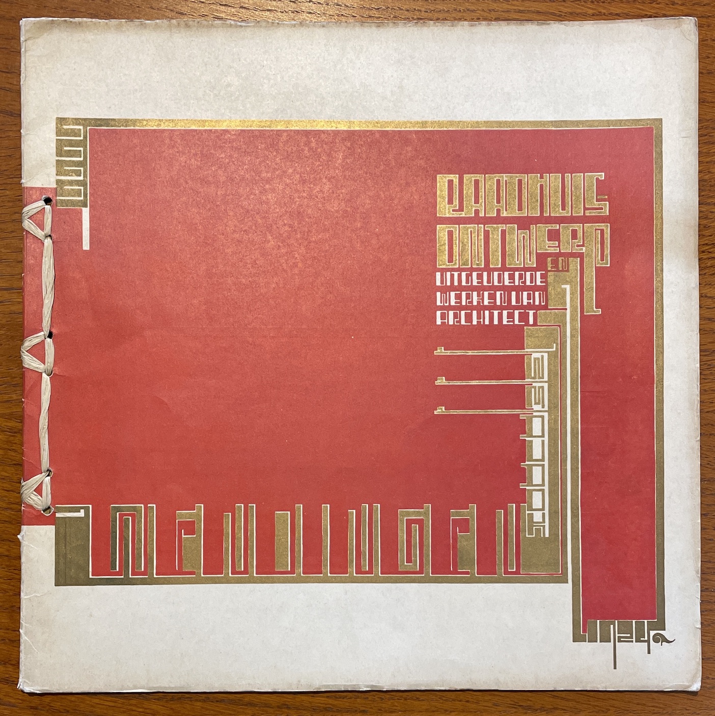

Wendingen.
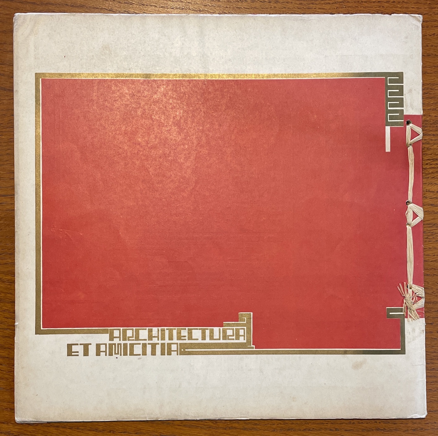
Maandblad voor bouwen en sieren van “Architectura et Amicita”. Redactie: C.J. Blauw – W.M. Dudok u.a.
Volume 6, 1924, issue 8.
40 pages with numerous drawings and photos, of which 16 pages are advertising appendices.
33 x 33 cm. Original wrappers, bound as a block book with raffia binding.
sold
Here I show a web page entry from the Dutch National Library that pays tribute to The Wendigen Magazine as a whole and to this issue in particular.
Wendingen, published from 1918 through 1931, is in many respects a remarkable journal. It was published by ‘Architectura et amicitia’, an Amsterdam-based society, and developed into the major representative of the Amsterdam School. This did not mean that it was only restricted to architecture: design, various visual art forms, even exotic subjects like shells and crystals were equally discussed in theme issues. Wendingen acquired international fame not only for its contents, but to a large extent also for its design. Its idiosyncratic, large square format (33 x 33 cm), its bifoliate infolded pages tied together with raffia à la japonais, but most of all its typography make it an impressive and unusual journal. The great mind behind it all was the architect H.Th. Wijdeveld. Inspired by the work of J.L.M. Lauweriks – who had already published a periodical called Ring in Germany in 1908, foreshadowing the advent of Wendingen – Wijdeveld designed the ‘Wendingentypografie’. This typography is characterized by the use of a sans serif (a grotesque) for the texts, the vertically eccentric position of text and illustration on the pages, and – most conspicuous of all – the composition of letters for the titles and the various captions from elements taken from the case of display types, a feature that encountered great opposition. ‘Illegible’ was the often heard reproof, and not unjustly so. Another remarkable characteristic is the design for the advertisements: despite individual differences they are all consistently framed by thick lines and printed in only one colour, which lend them a uniform appearance that smoothly fits into the overall design.
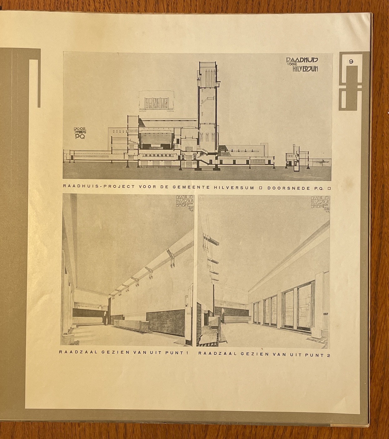
A good example of its idiosyncratic lettering is the cover of the Dudok issue reproduced here, an issue devoted to the Hilversum town architect W.M. Dudok. Although these letters have been drawn and subsequently lithographed, the similarity to the letters made up from type-setting material is obvious. It takes some time for the reader to find out that it concerns an issue of *Wendingen *(at the bottom), containing the ‘Raadhuis-ontwerp en uitgevoerde werken van architect W.M. Dudok’ (Dudok’s Townhall design and executed works) as shown on the opposite page. In itself this issue fits in perfectly with the series of theme issues devoted to architects. It has extensive reproductions of the designs for building the impressive townhall in Hilversum, which was eventually started in 1928.
Exceptionally beautiful and pristine copy.