Kurt Schwitters – Käte Steinitz – Theo van Doesburg – Die Scheuche
1925
verkauft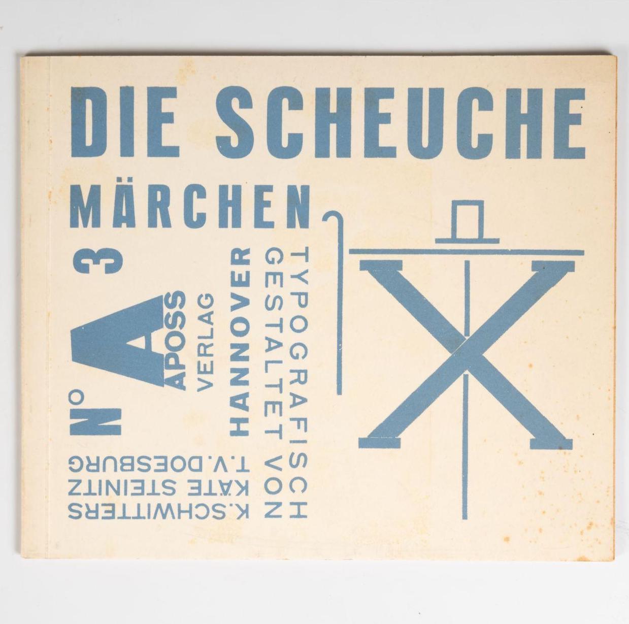
Kurt Schwitters – Käte Steinitz – Theo van Doesburg.
Die Scheuche. Märchen.
Hannover, Apossverlag 1925.
(12) pages printed in red and blue.
20,5 x 24,5 cm. Typographically designed original brochure.
sold
First edition. – Part of the book edition was later labelled Merz 14/15 by Schwitters with a strip of paper glued on. Three different designs of the front cover are known. Two variants are described in the subtitle as „Märchen“, one variant of which also contains the inscription „Aposs NO 3 Hannover“ turned 90 degrees anti-clockwise, as here in the offered copy. In the third variant, the artists eliminated the designation „Märchen“ and replaced it with the printed designation „Merz 14/15“, which can be traced back to a later inclusion in the Merz series.
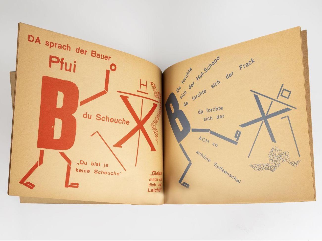
With „Die Scheuche“, Schwitters and Steinitz created a purely typographic picture book that dispenses with any drawings and uses purely typographic elements for the illustrations. „Kurt knew the typesetter Paul Vogt, who liked to play around with new typographic ideas in a small print shop. He let us run wild, was happy to cut the extra-large O we needed for Monsieur le Coq, the cockerel, and did not refuse, as any normal typesetter would have done, to set the small b as the peasant’s feet diagonally and the capital B completely diagonally for the angry peasant.“ Quoted from: Schelle, Der Typograph Kurt Schwitters A 16, Hannover 1987.